If we’re being honest here, every visitor to your website who doesn’t convert or contact you is a missed opportunity, costing you time and ultimately, money. Minimizing these types of users should be among your top priorities. It’s how you call them to action that helps give them the final push to convert.
Get your CTA (call to action) wrong, and all the effort and valuable content on your page gets lost in translation. If you want your website or email calls to action to do a better job of converting, meaning more clients or potential clients are engaging with you, here are a few tips we recommend you follow.
#1 Make them actionable
It goes without saying that a call to action should actually call users to act. Instead of simply displaying where the button will take the user, use action words like “get”, “try”, or “watch” to compel them to take action. So, instead of your CTA button reading “Demo”, it should say “Watch a demo”.
#2 Keep them short
Make your CTA too long, and it will turn off the user. Some experts say you should keep your CTA between 1 and 3 words to create the most impact. Others say between 6 and 90 characters is the sweet spot. Either way, think about your own experience as a user, “Click here to watch the incredible demo” will likely not catch your attention as well as “Watch a demo”. These days, users like bite sized information, so a shorter CTA is bound to perform better.
#3 Make them visible
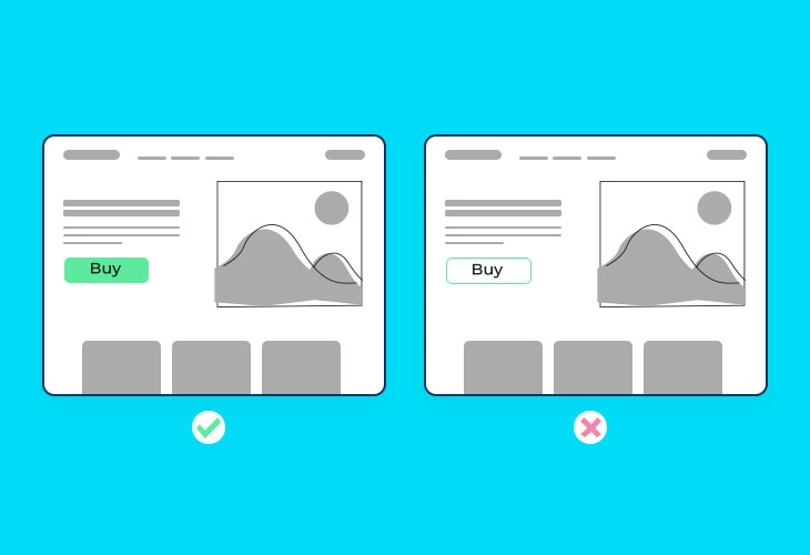
Nothing is worse than having the right wording chosen for your CTA, only for it not to be seen. Make your CTAs visible by keeping them bold and colorful. Make sure the text can be clearly seen (so white text on a yellow background might not be the most effective option), is presented in bold, and is striking enough to be noticed when a user looks at the page. The CTA button should jump out at the viewer. In addition to ensuring you have the right colors and bolded text, you also need the right size. You want your CTA button to be big enough but not overpower the content you have on the rest of the page.
#4 Choose the right location
Once you’ve written and designed your CTA and you feel it looks compelling and encouraging, it’s time to place it in the right location. You want at least one CTA to rest above the fold. The fold is basically what a user sees when they arrive at your page, without scrolling down. In addition to the fold, you also want a CTA to be presented throughout the text. Another great way to incorporate a CTA and ensure it’ll get seen is to present it in a pop up. Ultimately, you want one CTA per page.
#5 Add a sense of urgency
People hate missing out on good offers, especially if they feel they are time sensitive. Incorporating words like “now” into your CTA creates a sense of urgency that will make the user feel more obliged to clicking through. This is especially useful when you have special offers or discounts to display as they will help push the user to action.
#6 Make them personal
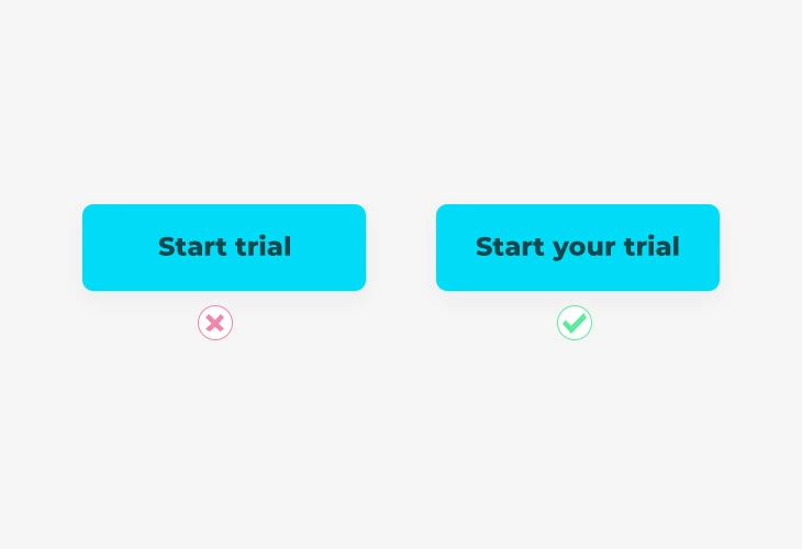
Personalization is the name of the game these days. And although you cannot go into your site or email and change the CTA button to include the user’s name, for example, you can use words like “you/your” or “I/me/my” to spice up your CTAs and make them feel more personalized. Instead of “Start a free trial”, you might want to make it “Start your free trial” and see how that performs for you.
#7 Test them out
What works for one business might not be the best practice for your business. You need to have patience and consistently test your CTA buttons as you go. The secret to success lies in the wording, the font, the color, the bold, the location, the personalization and so much more. It’s too many moving parts for you to figure out on your own. A/B test your CTAs with different copy, colors, designs and locations to see what works best for your audience.
#8 Use a tool like vcita
vcita helps you create CTA links that direct your clients to their own client portal where they can take actions such as pay, schedule, view their interactions with your business and more. These links can be sent via SMS or email or even added to your email signature or social media pages, making them accessible and visible to your clients. In addition, vcita enables you to add widgets to your site with CTA buttons encouraging clients to contact or schedule with you. These widgets are seamlessly integrated onto your site and visible from any page.
Start converting now!
Don’t waste your time and money on a CTA button that doesn’t convert. Use the tips above to create compelling CTAs that encourage clients and prospects to take action. Take into consideration all the factors that make a successful CTA and implement them into your own CTA strategy. Use tools and experts’ experiences to help evolve the way you think about CTAs and, once you’ve got it, get ready for an influx of business!


