Indulge us for a moment. Imagine yourself sitting alone in a cold and sterile dentist’s office.
Your mind is running wild with thoughts of your impending treatment. Everything in this waiting room scream of how terrible things are about to get.
Of course, this is just little guided imagery exercise but it does drive the point home: when we go see a doctor or a therapist, their office plays a huge role in setting up our expectations.
To win over clients’ trust, you’ll first need to create a warm and welcoming space where people feel they can let their guards down. Here are a few ideas to help you turn your home practice into a place where clients feel safe to be themselves.
Color: Shake Up That Palette
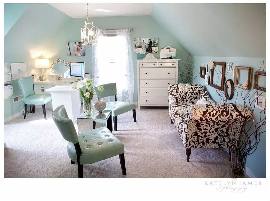
Did you notice that therapy offices typically host soft, soothing colors? Katelyn James’ office makes a great example of a space that was carefully designed to help people destress.

The interesting part? Katelyn’s not a therapist. She’s a photographer. But as a mindful professional, she understands that clients who walk into her studio need a little help to get over the awkwardness that comes from sharing intimacy with a stranger.
However, not all people are alike. Pastel hues can also backfire and put a client on guard (especially if they’re aware of the “soft, soothing hue” agenda).
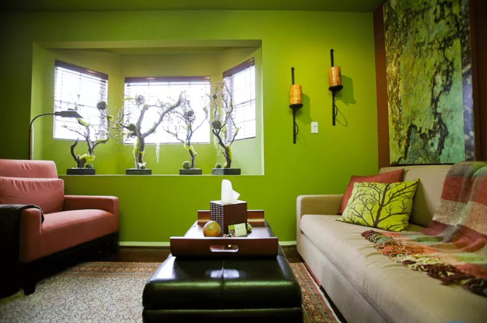
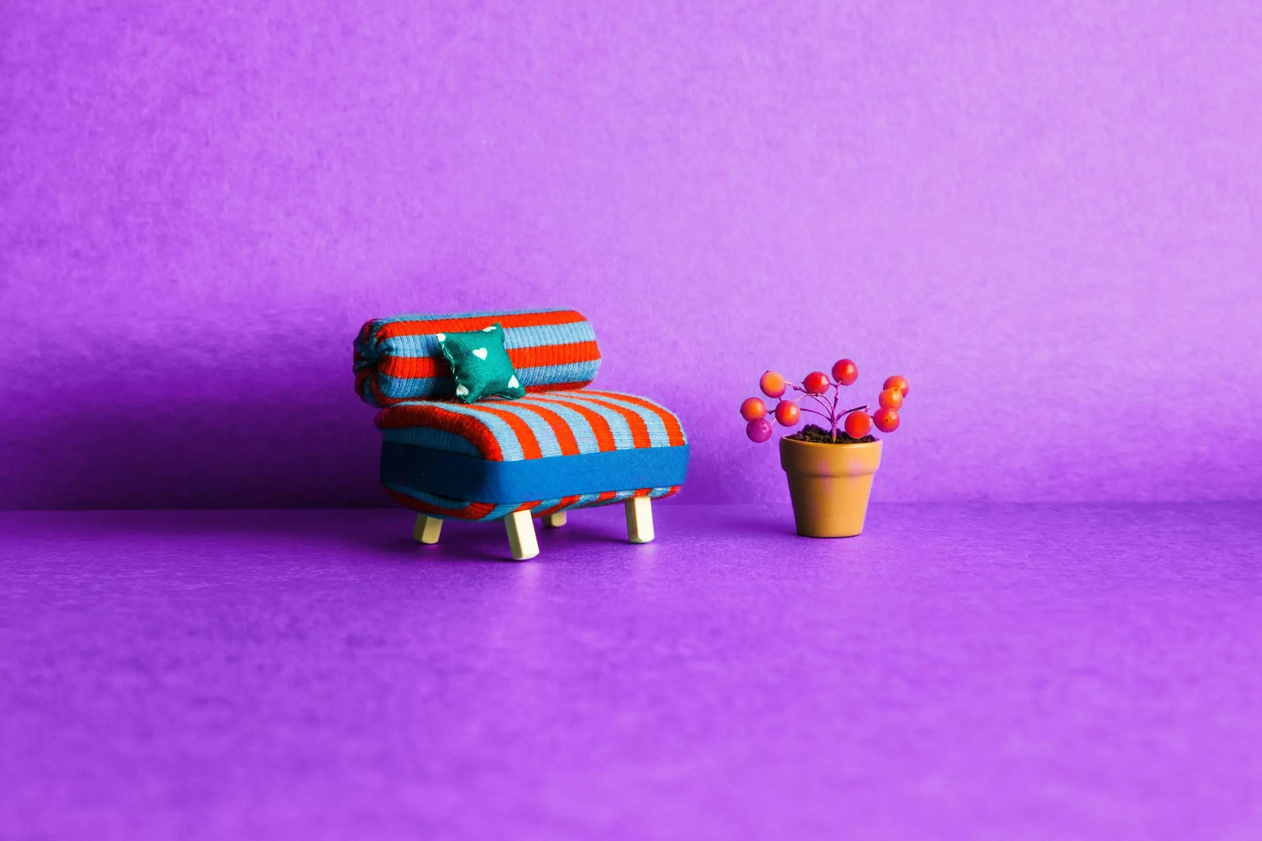
Our advice? Don’t be afraid to go out on a limb and use bright, bold colors.
Although colorful spaces naturally lend themselves to therapists working with children, we’d like to make the case that adults deserve some color in their lives too.
However, colors may also trigger emotions – and not necessarily positive ones. On the flip side, dark shades, like those used by Directions Counseling, can convey a formal, professional atmosphere.
And here’s an interesting angle for you: a formal environment may actually help some people switch off the body’s fight or flight response. The beauty in such an office environment is that it doesn’t lay any expectations on you. It’s just is. Designing a home practice that absorbs, rather than reflects people, can be a great idea.
Texture: How Do You Feel Today?
While color gets the lion’s share of the attention in design, texture is no less important in setting a friendly vibe.
For example, you can have an off-white wall… and then you can have an off-white brick wall. A world of difference, no?
And what about the therapy office of Dr. Ruthann Davis? Kind of reminds you of a log cabin out on some country farm, right?
Well… it actually is a log cabin (or at least a wall built of logs) on a country farm. Dr. Davis offers individual, couples and animal-assisted therapy, and we’re guessing that the rustic, down-to-earth nature of her office fits in with her farm and generates a helpful ambiance for her and her clients.
But it’s not only the walls where you can get creative with textures. How about your furniture?
Those wicker chairs create a relaxed, chatting-on-a-porch kind of feel, which may be exactly the kind of atmosphere your clients need to spread out and be themselves.
Accessories: Don’t Knock the Knick-knacks
Accessories can convey your personality, putting your clients at ease by giving them the sense that they already know something about you, even before you know something about them.
That office says personality all over it! A nice display of items in your office can also serve as therapy aids, fidgets or jump-off points when clients feel stuck and have trouble deciding what to talk about next.
If there’s a message you want to subliminally communicate to your clients, say it with an accessory. Throw pillows can work great for this, like these pillows created with stencils by therapist Kaye Bradley Williams.
Signs and knick-knacks with words can also do the trick, like this one from the office of Directions Counseling.
Nature: And the Green Grass Grew All Around
Instead of making it all about the interior design, how about bringing in some of the exterior? Nature is a natural at inducing relaxation and mindfulness. If you’re fortunate enough to have a beautiful view, don’t shut it behind closed doors; make the most of it!
Kari Gallego of Foothill Therapy’s office sits along a nature preserve and uses a floor-to-ceiling, wall-to-wall window to bring in the beautiful natural scenery.
Gardens are a little more common than nature preserves, so, situating your office off your garden can give over a similar feel, especially if you can plant some vegetation that enhances serenity and privacy.
But what if you live in an urban jungle, and the only trees for miles are scrawny little ones poking out of metal grates in the sidewalk, 17 stories down? In that case, try creating some artificial nature.
Yeah, that sounds ridiculous. But look how well interior designer Jonathan Fong did it for the office of teen therapist Sandra DuPont:

Makes you feel like you’re in a very modern enchanted forest, hey?
Don’t forget: animals are also a part of nature. While it’s not widely done to bring animals into a counseling space unless they are an active component of the therapy, stop and consider the idea. After all, fish tanks are ubiquitous in doctors’ waiting rooms because they’re proven to help people relax.
So try this on for size:
A bit extravagant, but oh… so relaxing.
Home Office, Sweet Home Office
Before you actually do any redesigning, spend some time thinking about who you are, who your clients are, and how to make your space a full partner in the counseling work you do. After all, a therapeutic space has a life of its own that stirs different emotions in each of us.


